SharePoint Intranet Design Elements that Drive Engagement and Adoption
Key Takeaways
- User-centric design beats assumptions. Research what employees actually need – not what IT or management thinks they need – and build the intranet around those real tasks and pain points. In Silicon Reef’s project with University of Leeds, this approach led to a 74% increase in staff saying they could access the tools and information they need from one central place.
- Fresh content is non-negotiable. A vibrant, regularly updated news feed combined with timely announcements is the single biggest driver of repeat visits. Stale content erodes trust in the entire platform.
- Personalisation and quick access win every time. Quick links to frequently used tools and audience-targeted content that shows employees what’s relevant to them dramatically increase daily usage.
- Performance and accessibility aren’t optional extras. An intranet that loads slowly or isn’t mobile-friendly will be abandoned by field workers and remote staff. Design for everyone, and engagement rises across the board.
Your SharePoint intranet is often the first thing employees see when they open their digital workplace. It’s a digital front door and – like any entrance – it should be inviting, functional, and purpose-built. But not all SharePoint intranets drive engagement equally. Some become go-to destinations that employees check daily; others languish as forgotten bookmarks gathering digital dust.
The difference lies in deliberate design choices. From news feed to quick links, how the homepage looks and how fast it loads, every element impacts daily use.
Using insights from Silicon Reef’s digital workplace projects, we’ll explore design elements that boost employee engagement and drive intranet adoption.
Want More SharePoint Intranet Design Tips?
Start with Research-Backed, User-Centric Design
The foundation of engagement is understanding what your employees actually need. Conducting user research – surveys, interviews, workshops – reveals the tasks and information your staff rely on daily. Only then should you design around those needs.
For example, in our project with the University of Leeds, workshops revealed that finding work-related tools and HR information were key for staff. These weren’t flashy features or nice-to-haves; they were fundamental to getting work done. In response, we added an easily accessible “My Tools” section to the new intranet’s homepage. It features personalised quick links and a prominent policy hub. The focus here was on solving real pain points which naturally encourage daily use – not just adding bells and whistles.
One of our favourite ways to ground intranet designs in evidence is tree testing. This UX exercise strips away visual design to test whether your information architecture actually makes sense to real users. It’s a practical way to validate that your navigation and content structure work before investing in full design and development.
Design Elements That Boost Intranet Engagement
Fresh news and announcements
A vibrant news feed or carousel highlighting company updates, events, and leadership communications gives employees a reason to return frequently. Westminster Abbey’s intranet (AbbeyNet) demonstrates this beautifully. Staff praised the homepage for being “vibrant and news-focused,” which helped them see important updates in one place without hunting through multiple channels.
The key is making it feel current, not corporate. Mix leadership messages with team celebrations, practical tips with strategic updates. Featuring timely content – weekly company news, project wins, new initiatives – helps centralise communications and keep everyone informed.
Personalised quick links
Quick access to frequently used apps and resources drives adoption more than almost anything else. If employees know they can jump to HR systems, IT help, expense forms, and their daily applications via the intranet, they’ll use it every day.
One best practice is a “My Tools” widget that each user can customise. This was the most-used feature on TP ICAP’s intranet. In their homepage refresh, we added a personalised quick links bar that employees can tailor with the tools that matter to them. By making the intranet the launchpad for daily work, you dramatically increase engagement.
Hero banners and featured content
A visual hero section at the top of the homepage can grab attention for key campaigns or resources when used wisely. An internal campaign, a CEO welcome video, or an employee spotlight all work well.
TP ICAP wanted more visual impact on their homepage, so we provided creative header options like full-width banners and multimedia carousels to promote priority content in an eye-catching way. Just ensure hero content is kept current and relevant. Nothing undermines engagement like a banner advertising an event that happened last quarter.
Audience targeting and personalisation
Relevance is king. Use SharePoint’s audience targeting to show content based on department, location, or role so employees see what matters to them without noise. A multinational organisation can target regional news to each employee’s country, or show HR policy updates only to managers.
Gulf Oil’s global intranet employs this strategy – content is tailored per region and function so people get a personalised experience while still sharing a common platform. This balance of global and local content keeps users engaged because the homepage “speaks” to them, not at them.
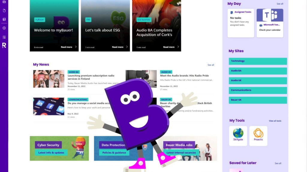
Another good example of this in practice is Bauer Media Group’s myBauer intranet, which we built to bring together global company news, business-unit updates, and personalised tools in one experience. In the video overview below, you can see how the intranet surfaces Bauer Group-wide news alongside news and updates specific to each employee’s business area, unit, or function, so what appears on the page feels tailored rather than generic. Combined with role-based personalisation, this targeted news model makes myBauer feel like your intranet, not just the intranet.
Social and community features
Inviting interaction can turn an intranet from a one-way bulletin into a lively community space. Consider embedding social feeds, like Viva Engage conversations, or interactive elements like polls and comments.
A short poll or a shoutout for a colleague’s achievement can spark engagement. Modern intranet design trends show that celebrating people – highlighting new hires, work anniversaries, or team successes on the homepage – can significantly boost morale and repeat visits.
Prominent search
Many employees will head to the intranet simply to search for something – a policy, a person, a file. A prominently placed search bar that yields useful results is crucial.
We saw this at Leeds: only 24% of staff felt they could easily find information before the redesign, due in part to poor search functionality across disconnected sites. In the new intranet, everything was consolidated “under one roof” and SharePoint’s search capabilities, combined with better information architecture, made content easy to find.
Invest in configuring search properly, ensure content is well-tagged, use promoted results for common queries, and monitor what people are actually searching for.
Clear, intuitive navigation
Employees shouldn’t struggle to navigate the intranet. A well-structured menu or mega-menu with logical categories – by department, by task, by topic – helps employees explore without getting lost.
A top navigation might have sections like “Teams & Departments,” “Tools & Services,” “HR & Benefits,” and “News.” In the Westminster Abbey intranet, we worked with their team to define an intuitive site structure so staff – even infrequent users – could quickly get to HR forms, staff directories, or news from the homepage with minimal clicks.
Keep navigation shallow (avoid too many nested sub-sites) and consistently accessible. Good navigation reduces cognitive load, making the intranet feel easy, which encourages return visits.
On-brand visual design
Looks aren’t everything, but they do matter for first impressions. The homepage should reflect your organisation’s identity and be visually appealing. Use company branding – logo, colours, fonts – in a polished way to make the intranet feel like an internal product of company culture, not a generic SharePoint site.
We often use design tools, like our Beacon branding add-on, to go beyond default SharePoint styles. TP ICAP’s seven-day overhaul delivered a fresh design with the correct brand fonts, colours, and even gradient accents that out-of-the-box SharePoint couldn’t easily do. A visually modern design that “looks like us” can instil a sense of ownership and professionalism, subtly encouraging employees to use it.
However, visuals mustn’t trump usability. We ensure designs remain uncluttered and mobile-responsive. Westminster Abbey’s team specifically wanted to avoid a heavy “corporate” look, so we balanced strong Abbey branding with a clean, inviting layout. The result was widely appreciated for being “cleaner and clearer” – not just pretty, but functional.
Performance and accessibility
Engagement will suffer if the intranet is slow or unfriendly to a segment of employees. Optimise load times by using modern SharePoint web parts efficiently – a few well-chosen images instead of many large ones – and design for accessibility with high contrast, alt text on images, and keyboard navigation.
With many employees now on mobile or hybrid work setups, a responsive design is mandatory. Making sure a frontline worker on a smartphone or an employee with assistive tech can comfortably use the intranet is non-negotiable. When everyone can access it easily, overall engagement increases.
Dynamic, fresh content
An intranet should never be static. Stale content kills engagement. If employees see the same old announcement for weeks, they’ll stop paying attention.
Assign content owners to update the homepage regularly with new posts, announcements, or even fun content like monthly wellness tips or employee spotlights. Some homepages, for example, include dynamic sections like “What’s New” or “Today’s Events.” In our experience, clients who treat the intranet like a living platform – updating it frequently and curating content – see far better adoption than those who “set and forget” it.
Real-World Impact
By incorporating these elements thoughtfully, your SharePoint intranet becomes a one-stop shop that employees find useful and even enjoyable.
As one staff member enthused after we redesigned their intranet:
“Simple to use, quick to browse, and well-presented throughout. Looks as though most information I need is on one platform for the first time…ever!”
That’s the reaction you’re aiming for. A homepage that makes work life easier and brings the company together, ultimately driving both higher intranet adoption and employee engagement.
How Silicon Reef Helps Design Engaging SharePoint Intranets
Designing an engaging SharePoint intranet is easier when you are not starting from a blank page or guessing what people want. Our people-first approach combines user research, UX design and deep SharePoint expertise to turn the principles in this article into a concrete intranet that fits your organisation.
In practice, that usually means:
- running discovery activities (surveys, interviews, workshops) to understand employee tasks, pain points and content needs;
- designing information architecture, navigation and page templates that reflect how your organisation actually works;
- creating homepage and key page layouts that balance news, tools, search and navigation in a clear, uncluttered way;
- applying brand‑aligned visual design – colours, typography and components – so the intranet feels like part of your culture;
- building and configuring the intranet in SharePoint Online with performance, accessibility and ongoing content management in mind.
Whether you want to refresh an existing SharePoint intranet or build a new one, we can help you move from “generic SharePoint site” to a user-centred intranet that employees actually choose to use.