Accessible by Design
Creating Inclusive Digital Workplaces with SharePoint
Learn how to build digital workplaces where accessibility isn’t an afterthought—it’s baked in from the start.
Our Accessible by Design guide takes you through eight inclusive design principles for SharePoint, real tools that actually work, and expert advice from our team. Whether you’re an internal communicator, intranet manager, or digital leader, you’ll find everything you need to create workplaces where every employee can thrive.

What’s Inside
This guide walks you through building truly inclusive digital workplaces, from the thinking behind it all to the practical tools and principles you’ll need. We’ve designed it to feel less like a compliance manual and more like having accessibility experts in the room with you.
- Why Accessibility Matters – Understanding how inclusive design benefits your entire workforce, not just a few, and why it matters for engagement, retention, and belonging
- Eight Inclusive Design Principles – Practical, actionable guidance covering page layout, headings, links, images, colour contrast, readability, consistency, and navigation
- Accessibility Tools That Work – Using SharePoint’s Accessibility Assistant, video captions, transcripts, and brand centre features to do the job properly
- Real Advice from the Silicon Reef Team – Common accessibility slip-ups and the simple fixes that actually make a difference
- Accessibility Audit in Action – What we learned conducting a comprehensive accessibility audit and what it revealed about creating truly inclusive digital spaces
Who Should Read This
Whether you’re leading digital workplace strategy or hands-on with the day-to-day, this guide is built for people who want accessibility to feel like a natural part of how things work—not something bolted on at the end.
- Internal Communicators – Creating accessible, engaging content that lands with your whole workforce
- Intranet Managers – Leading the charge on accessibility and embedding it into how your platform works
- Digital Channel Owners – Making sure every employee-facing digital space is genuinely usable for everyone
- SharePoint Administrators – Building an environment that supports accessible design as standard
- Anyone with Digital Workplace Responsibility – HR leaders, IT teams, and business change professionals who want to get this right
Sneak Peek
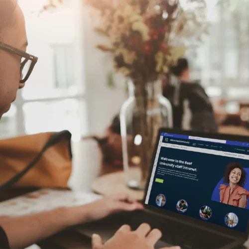
Truly inclusive digital workplaces are built with people at the centre – embracing accessible design to create environments where every employee can thrive. In the simplest of terms, it’s all about making internal systems as usable and inclusive as possible.
For too long, accessibility has been thought of as something that only matters for a small percentage of the workforce. This couldn’t be further from the truth. In reality, a huge spectrum of employees are negatively impacted by poor design choices regarding the accessibility of workplace tech. Alongside increased awareness, changes in legislation and the ongoing ‘war for talent’, it’s more important than ever before to make workplace accessibility and inclusion a top priority.
This guide is here to support your organisation on its accessibility journey by exploring how to design a fully accessible digital workplace within Microsoft 365.
Let’s jump in.
Why Accessibility Matters
In today’s society, it’s no longer accepted that accessibility is something that only a minority of organisations care about. There’s a clear expectation for employers to prioritise inclusion – going over and above their legal requirements to help level the playing field for every single employee.
Accessible workplace tech is not just a ‘nice to have’ perk that only benefits employees with a disability – it’s an essential requirement for an engaging, welcoming environment where everybody can do their best work.
So why does accessibility matter so much when it comes to the design of your digital workplace? Let’s start by flipping that question on its head – why would you not want to make the site you’re creating usable for as broad an audience as possible? Accessible digital workplaces benefit all employees, from supporting workers in noisy environments with something as simple as video captions or transcripts, to enabling those who rely on assistive technology by designing and structuring pages in the right way.
We do SharePoint really well. When we say accessibility doesn’t mean compromising on brand, we mean it.
The video to the right shows what’s possible when accessibility and design are prioritised from the start.
But we don’t stop at SharePoint. We help internal communicators turn tools like Viva, Copilot, and the wider Microsoft 365 suite into strategic communication platforms – not just another channel. Here’s a quick look at how we do it:
Additional FAQs
Why is good SharePoint intranet design important for internal communications?
What are the key elements of great SharePoint intranet design?
A successful SharePoint intranet should be visually engaging, easy to navigate, and aligned with your company’s branding. Important elements include:
✅ Clear branding – Using company colours, fonts, and logos for a professional, cohesive look.
✅ Personalised experiences – Tailoring content and news feeds to different employee groups.
✅ Accessibility – Ensuring content is easy to read and navigate for all users.
✅ Integration – Connecting with Microsoft 365 tools like Viva, Copilot, and Power Platform.
Download our SharePoint Intranet Design Guide for more practical tips and a design checklist.
What common SharePoint intranet design mistakes should be avoided?
Many SharePoint intranets fail due to cluttered layouts, broken links, poor accessibility, and outdated content. Employees quickly disengage if an intranet is hard to use or doesn’t provide relevant information. Our guide includes a ‘Design Naughty List’, highlighting mistakes to avoid and best practices for building a site that keeps employees engaged.
How can SharePoint be customised to create a more engaging intranet?
Where can I find expert advice on designing a better SharePoint intranet?
Our SharePoint Intranet Design Guide is packed with expert insights, design tips, and a step-by-step checklist to help you create a modern, user-friendly intranet. If you need tailored advice, book an Art of the Possible session with our team to explore how SharePoint, Viva, Copilot, and Power Platform can transform your digital workplace.