If you’ve landed on this blog, then you’re likely facing the same challenges as thousands of SharePoint users across the globe – how to make SharePoint look good.
We work with SharePoint every day, and we don’t doubt its abilities as an engaging, collaborative intranet. But, it does have some limitations. And those limitations are largely around design; creating an online space that works like SharePoint but feels like your brand.
As consumers, we’re used to well-designed, engaging, intuitive digital experiences. As employees, we should be afforded the same.
So the question is, how do you make SharePoint look good?
1. Start with UX
If you want to make SharePoint look good, it can be tempting to jump straight into designs. But, it’s good to know what you’re designing and why.
Starting with user research and UX activities can help shape your SharePoint intranet, how it looks, and how it should work. User research can uncover employee pain points or goals and is more extensive than a simple internal survey.
Understanding what your employees need from SharePoint will inform your design process, and make sure your design serves a functional purpose and looks good. It can also help identify what’s not important. There’s no point squeezing content into your design that won’t be used.
UX activities like card sorting and tree testing can make sure your design is intuitive, accessible, and visually pleasing. A beautiful design is no use if employees can’t find the information they need.
Starting your design process with UX can guide the rest of your design process and help find the balance between pretty and practical.
2. Bring in Your Brand
Internal branding is just as important as your external-facing brand.
A powerful brand image can foster a sense of belonging and community but for this to really work, your brand presence needs to be felt across every touchpoint. Your physical office, online workspace and external facing website should all evoke the same feeling of togetherness.
But this can sometimes be easier said than done in SharePoint.
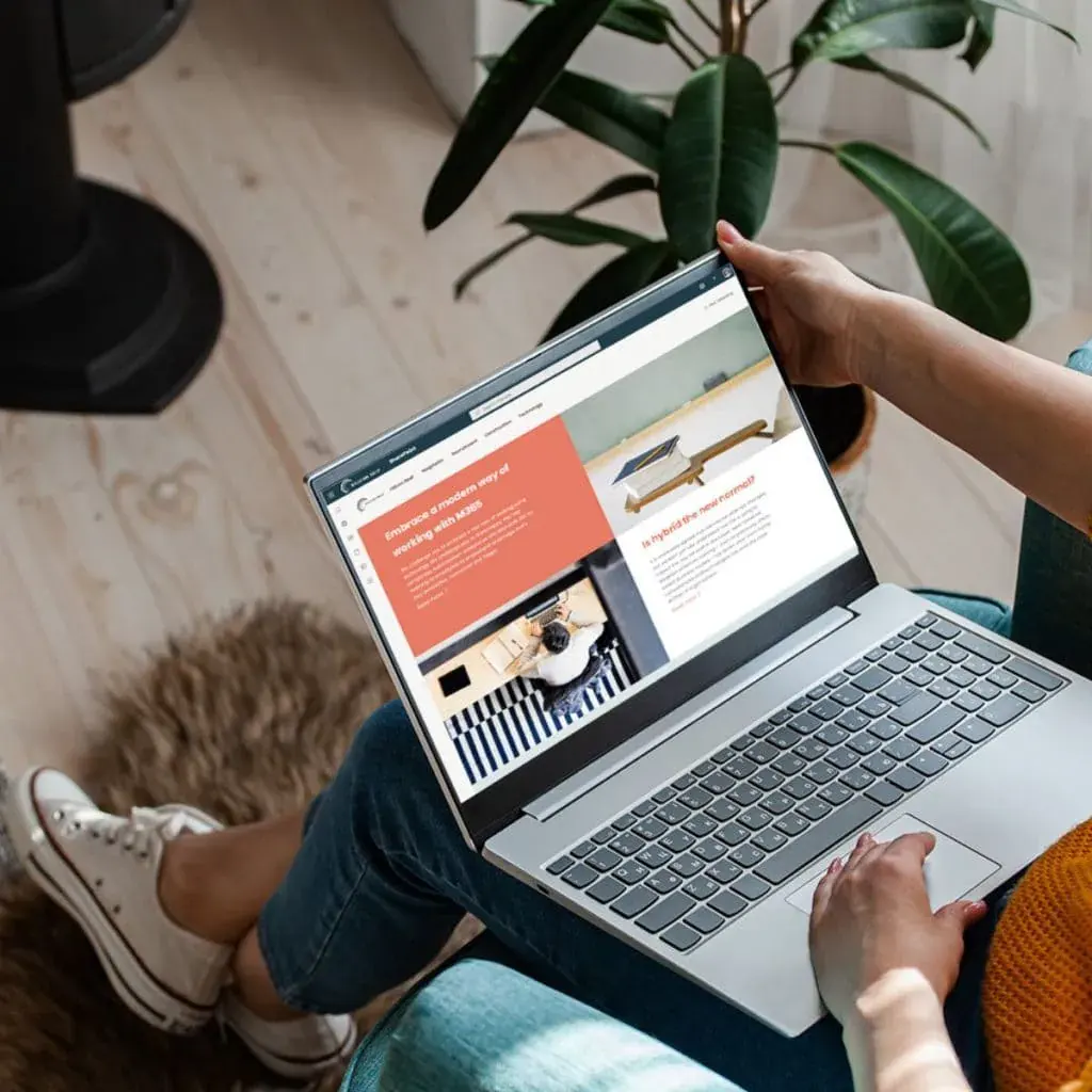
With tools like Beacon, you can customise your SharePoint intranet to fully encompass your brand on the same level as your external website. Bringing in your logos, fonts and colours can help with that community feel.
3. Don’t Forget Mobile
It’s no use taking the time to make your SharePoint site look perfect on desktop if it’s not useable on mobile. Especially for businesses with employees who aren’t desk-based, considering mobile in your design approach is a key part of making your SharePoint site feel inclusive for everyone.
Quick tip – make sure your navigation bars and menus aren’t too long and will show on any device.
4. Experiment with Content
Using different types of content or layouts within your SharePoint site can help to break up sections, and be more visually pleasing.
You can choose section layouts like single column, double column or full-width to display content in different ways. Or, play with how images are displayed using different web parts like Image, Image Gallery and Hero. Beacon can also help you enhance how your content is displayed with components like Image Hotspot and Content Spotlight.
Being bold and trying new layouts and content types can keep your SharePoint feeling fresh.
5. Check Out Templates
If your resources are limited, SharePoint design templates are a good starting point. Microsoft has a whole host of pre-designed templates for communication and team sites, which are perfect for smaller teams or organisations.
Some of the templates include:
· Crisis Management – sharing news and providing support in times of crisis
· Department – engaging teams with departmental news, events, and resources
· Onboarding – welcoming new starters and guiding them through the onboarding process
· Event Planning – planning upcoming company events
· Store Collaboration – connecting with on-the-ground retail teams
Making SharePoint look good isn’t always as straightforward as we’d like it to be – but there are options. If you’re looking for guidance on how you can improve your SharePoint design, get in touch.
Say Goodbye to Boring SharePoint
Download our SharePoint design guide for tips on evolving your intranet, including best practices and art-of-the-possible
")